Hiep Hoa Asian Food Market
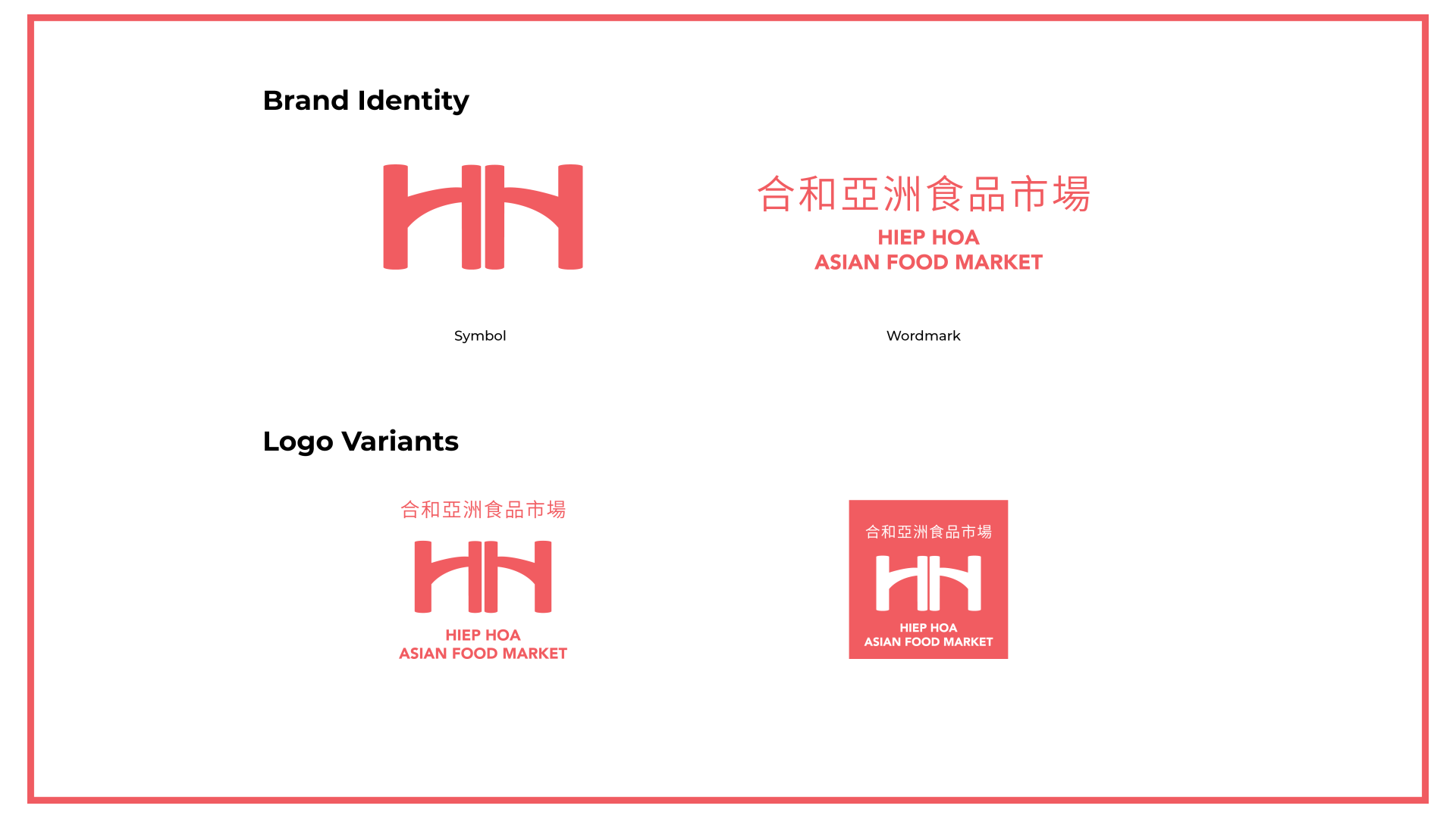
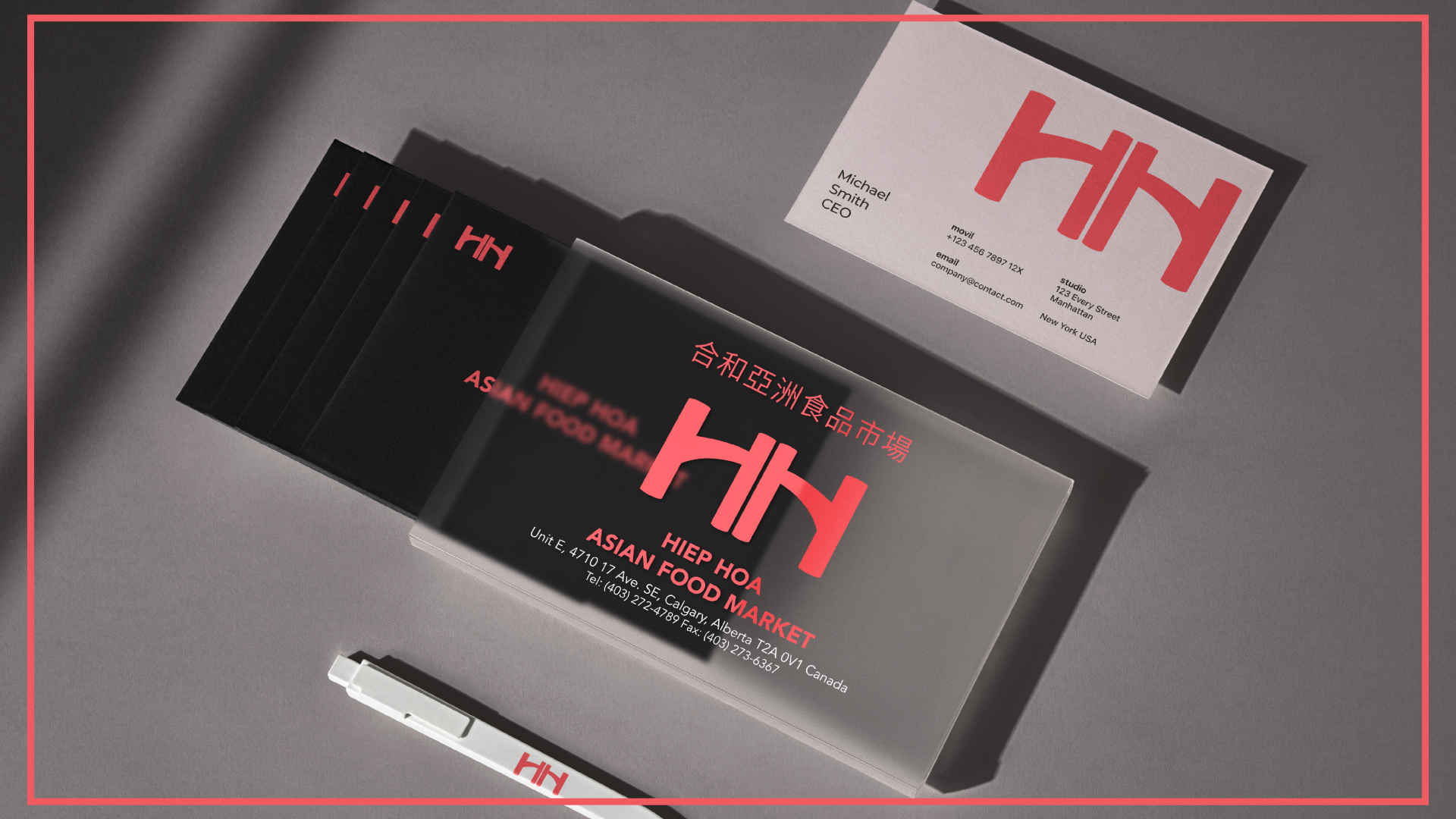
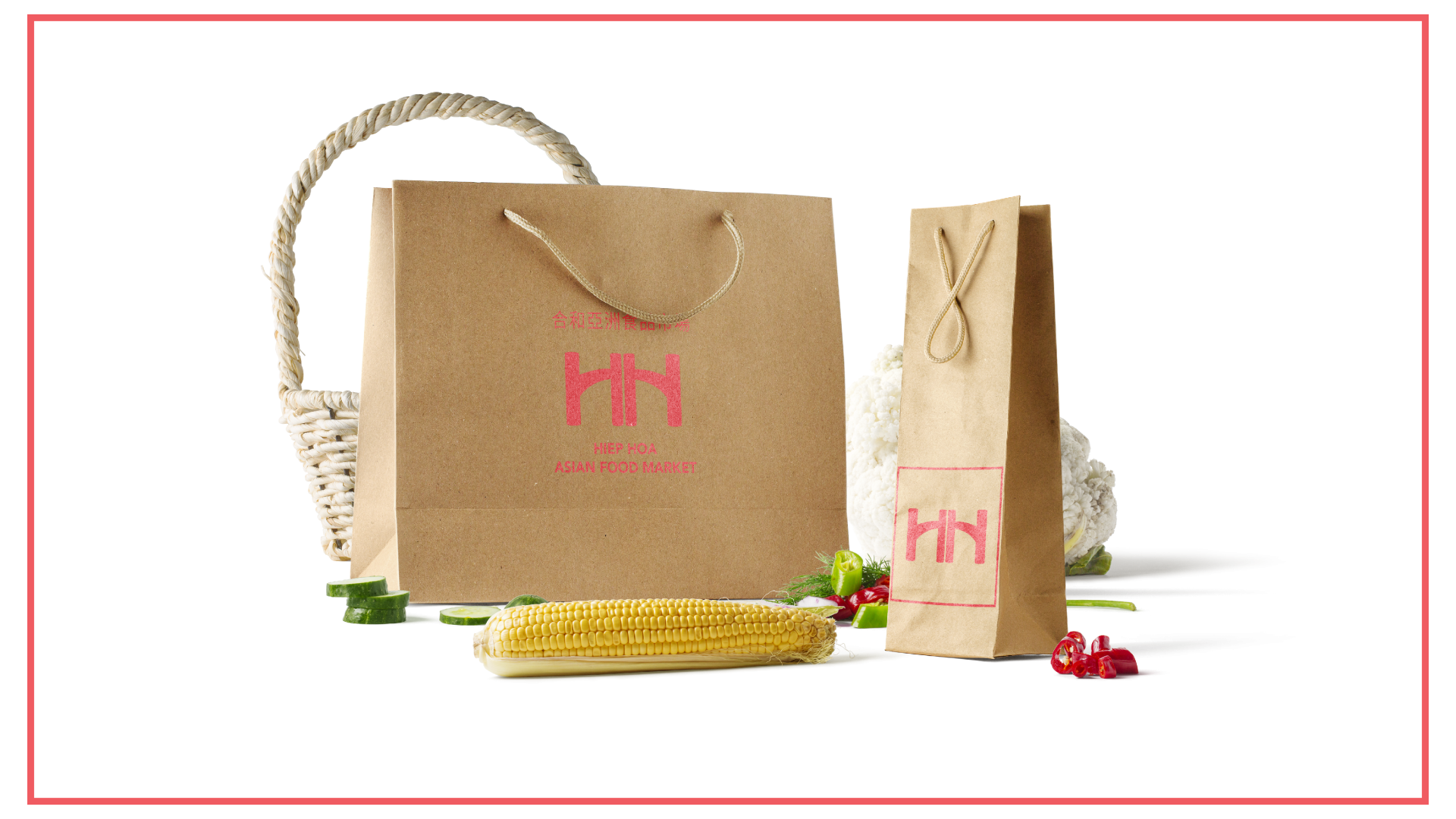
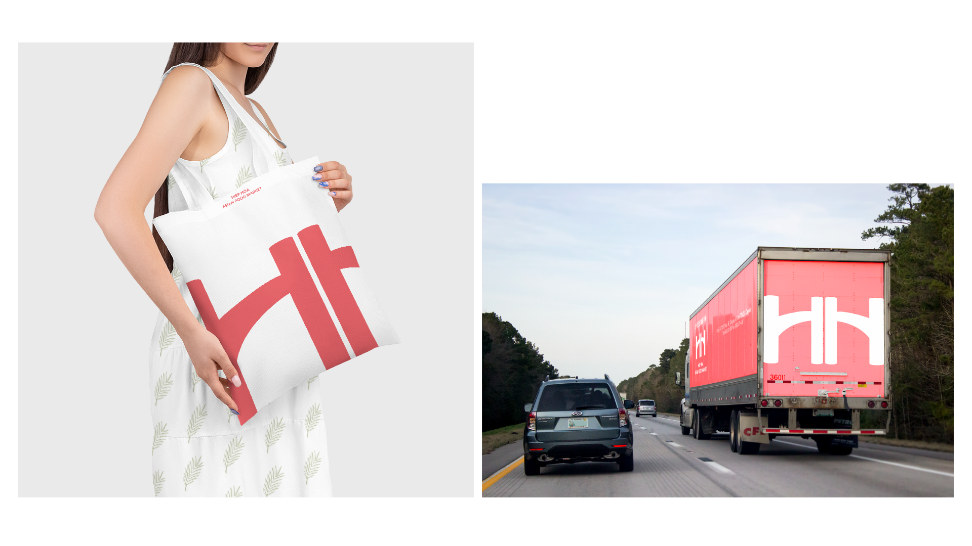
Logo: The wordmark for Hiep Hoa Asian Market cleverly incorporates two stylized “H”s to create the feeling of a door, symbolizing the welcoming entrance to a world of Asian culinary delights. The bold and clean lines of the logo reflect the market’s modern and professional approach, while the choice of vibrant colors adds a touch of excitement and energy.
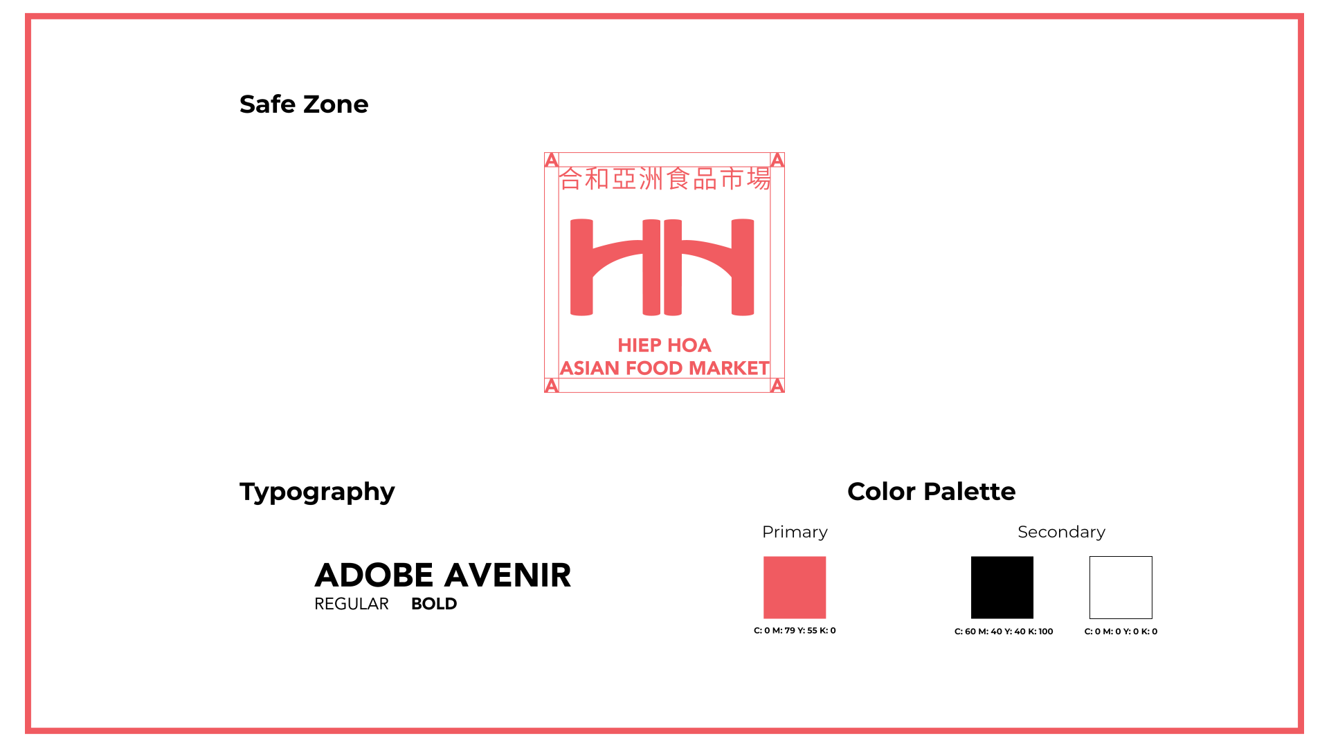
The color palette used for Hiep Hoa Asian Market includes the vibrant and captivating shade of #F05C61. This color, a rich and warm hue of red, is carefully chosen to reflect the essence of Asian culture and cuisine. It symbolizes energy, passion, and the bold flavors that can be found in Asian dishes. The use of this color in the brand’s visual elements, such as the logo and website, helps to create a visually appealing and memorable experience for customers, inviting them to explore the diverse flavors and cultural treasures of Asia.
Typography: For the brand’s typography, a clean and modern sans-serif font is used to convey a sense of professionalism and simplicity. The chosen typeface is easy to read and versatile, ensuring legibility across various applications such as signage, packaging, and digital platforms.